
I’m sharing this picture from one of the recent hikes near Jaipur. It was captured an hour after the sunrise in a beautiful location. Featured here is a hiker posing as the custodian of a derelict fort.
Following the tradition of Wordless Wednesday, I have posted a monochrome picture this time too. What’s your opinion? Do you feel that a color picture makes for a better frame?
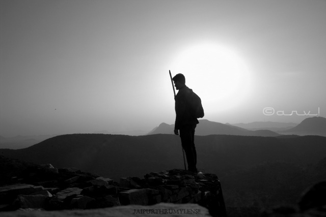
Posted for Wordless Wednesday
Stay updated with Jaipurthrumylens!! on Facebook Twitter Instagram
Discover more from JaipurThruMyLens
Subscribe to get the latest posts sent to your email.

You captured the tonal variations in the landscape shot very well. I believe this photo is more effective in monochrome, Arv!
LikeLiked by 2 people
I also feel contrast and tones are better captured in monochrome. But I guess certain aspects look better in color like dust and fog etc.
LikeLiked by 2 people
I think a color one would do more justice to the beautiful background, though this BnW one created the effect of a silhouette better.
LikeLiked by 1 person
Certainly, each has its own magic. B&W eliminates “extra” and focuses on its true essence. On the other hand, colored picture depicts the details better.
LikeLiked by 1 person
True that!
LikeLiked by 1 person
🙂
LikeLiked by 1 person
That is a fabulous picture arv, you have to post both to highlight the contrast or the effect they create.
LikeLiked by 1 person
I guess you are right. Next time…for sure! 🙂
LikeLiked by 1 person
Arv, I feel that this image has a greater impact, rather than color. It tells a story
LikeLiked by 1 person
The beauty of monochrome is that it lets you soak in its true essence. It eliminates the “extra”! What;s your opinion?
LikeLike
Indeed, that’s sometimes the case for certain images, I agree with you Arv.
LikeLiked by 1 person
🙂
LikeLike
Beautiful silohouette.
LikeLiked by 1 person
Thanks 🙂
LikeLike
As much as I love colour photography, I still think there is something extra special about a good black and white photograph.
LikeLiked by 1 person
I agree. I like B&W for its ability to highlight things in a better way! Thanks for sharing your views. 🙂
LikeLiked by 1 person
Great shot Arv. 🙂
LikeLiked by 1 person
Thanks, Lorelle 🙂
LikeLiked by 1 person
A captivating picture and pen picture indeed!
LikeLiked by 1 person
I’m glad you liked it, Swati 🙂
LikeLike
Breathtaking capture. I love sunsets anyways .. ❤
LikeLiked by 1 person
Thanks. Would love to see the sunset captures.
LikeLike
Monochrome is always preferred however few photos require colour, suppose if you wish to show spring or autumn colour or some intricate glass work on a haveli.
LikeLiked by 1 person
I agree. I have already mentioned this in another comment that color helps in highlighting the details. Monochrome on the other hand accentuates emotions. Do you click monochrome pictures?
LikeLiked by 1 person
I do click, but mainly when I am either clicking a face or some monastery or old architecture.
LikeLiked by 1 person
Great 🙂
LikeLike
In my opinion, black and and white photos tell the story more… Beautiful capture, Arv…
LikeLiked by 1 person
Thanks, Nurul for ratifying. 🙂
LikeLiked by 1 person
You are welcome 🙂
LikeLiked by 1 person
🙂
LikeLike
It’s a nice shot. I’m partial to colour when it comes to the sun though. 🙂
LikeLiked by 1 person
I can understand your perspective, Cheryl! 🙂
LikeLiked by 1 person
The scripted is so well written and then the execution has to follow the sentiment of the beautiful scripting. There is mystic aura in the composition of black and white. It does take the beauty to a different stratosphere. It appears pure and clear. There is no noise hidden in the branches of colour. It would always be a good idea to put the color picture next to the black and white, and one can see the contrast, life after all is so much in relative perspective.
Always appreciate your wonderful efforts and making the moment count and you take that extra effort to capture that special moment that the nature gives to us.
LikeLiked by 1 person
Thanks, Nihar. Will post both next time for everyone to compare and decide. I agree that B&W has its own beauty. Thanks for enlightening us with your thoughts. 🙂
LikeLiked by 1 person
Always a pleasure and keep up your great work with the lens…and you put lot of efforts and it shows up in every piece of your work.
LikeLike
I Think this looks so effective!!!
LikeLiked by 1 person
Thanks for sharing your thoughts, Ritu! 🙂
LikeLiked by 1 person
This is a brilliant shot and it left me mesmerised. Not too sure if colour would to justice to the fascinating silhouettes. So glad to have you link up with us on #WordlessWednesday.
LikeLiked by 1 person
I’m glad you liked it, Natasha 🙂
Happy to link it with your post. 🙂
LikeLiked by 1 person
This is a cool picture, I liked it. But adding colors also would have given a better taste I think.
LikeLiked by 1 person
Thanks for sharing your perspective, Shruti. I will post a color picture as well, next time! Just out of curiosity, how did you discover this blog?
LikeLiked by 1 person
Hey…actually I wanted to read blogs on Rajasthan tourism and specifically Pushkar fair. I searched for it and yes your blog came first on my window 🙂
I like your writing style along with the beautiful pictures. You do great work for giving insights of Rajasthan.
Cheers!
Shruti
LikeLike
I love monochrome. Some moods, some pictures look best in B&W. I think this is one of them… 🙂
LikeLiked by 1 person
I agree, Maniparna 🙂
LikeLiked by 1 person
New year wishes!
LikeLike
First I read the description that informed about the place and the time of the day, specifically the Sin Set time. Going by the narration, I felt the photo would have looked more majestic in colour. It would have give justice to the subtle shades at the horizon.
Without the narration, the photo as a stand alone, looks aristocratic courtesy monochromatic hues.
LikeLiked by 1 person
I agree. I will post colour picture as well, next time. Thanks for sharing your views.
LikeLike
I don’t have mush idea about photography but the monochrome looks awesome.
LikeLiked by 1 person
It is not about photography. It is about the visual appeal! 🙂
LikeLiked by 1 person